Mastering Customer Feedback Dashboards with Excel & Power BI
In the digital age, understanding customer feedback is more crucial than ever. While written data provides insights, visual representations offer clarity and immediate action points. Leveraging the capabilities of Microsoft Excel and Power BI, we’ve curated comprehensive video tutorials on our YouTube channel. Dive into this blog for a snapshot of what you can expect in these tutorials and the unique strengths of each platform.
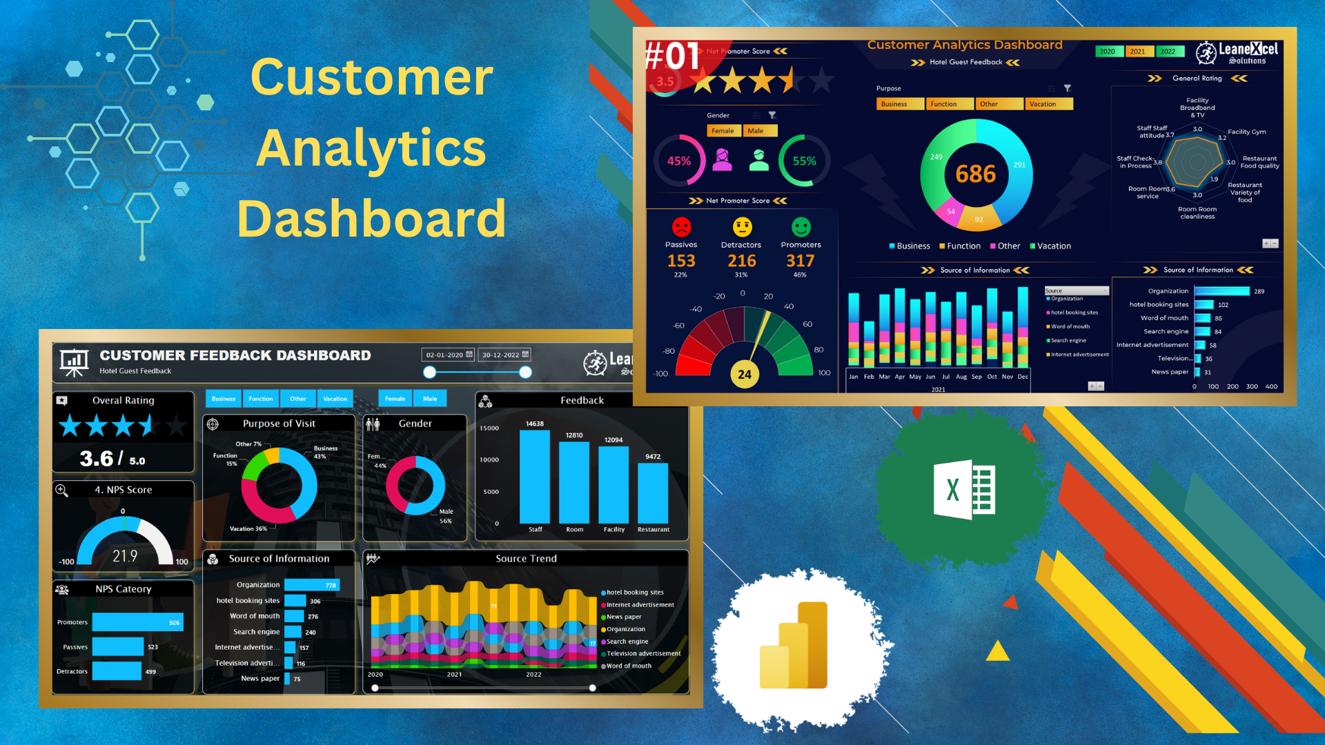
Building a Dynamic Dashboard in Power BI
Taking a step further, our Power BI tutorial on YouTube introduces you to the robust capabilities of Power BI. From creating real-time feedback surveys to designing intuitive dashboards, this tutorial covers it all.
Features that Make Power BI Stand Out:
- Interactive Visuals: Navigate through real-time customer feedback using dynamic visuals.
- Net Promoter Score (NPS): Efficiently categorize feedback and gain more profound insights into customer satisfaction.
- Custom Themes: Personalize your dashboard, making it more aligned with your brand and aesthetics.
Crafting an Interactive Dashboard in Excel
Our Excel dashboard tutorial, divided into two parts, guides you step-by-step in transforming raw survey data into interactive visuals using Excel’s Power Query and PowerPivot.
Excel Dashboard Tutorial - Part 1
In this segment, we introduce you to the foundational aspects of building the dashboard:
- Data Transformation: Learn the intricacies of using the Power Query editor for initial data manipulations.
- Linking Tables: Understand how to connect various data tables in PowerPivot to maintain a cohesive dataset.
- Visual Creation: Dive into the process of setting up fundamental visuals such as gender-specific graphs and overall rating visuals.
Excel Dashboard Tutorial - Part 2
This continuation delves deeper, enhancing the dashboard’s interactive capabilities:
- NPS Visuals: Explore the importance of the Net Promoter Score (NPS) and its integration into the dashboard.
- Advanced Formatting: From adding icons to refining the slicer, master advanced Excel formatting techniques.
- Visual Exploration: Enhance your dashboard’s user experience by introducing elements like radar charts, bar charts, and trend visuals, among others.