Introduction:
Diverging bar charts are an essential tool for any data enthusiast’s arsenal, providing a clear and impactful way to compare two datasets. Whether you’re analyzing year-over-year sales, inventory levels, or customer satisfaction scores, these charts make it easy to spot trends at a glance. Today, I’ll guide you through creating diverging bar charts in Excel and Power BI, step by step.
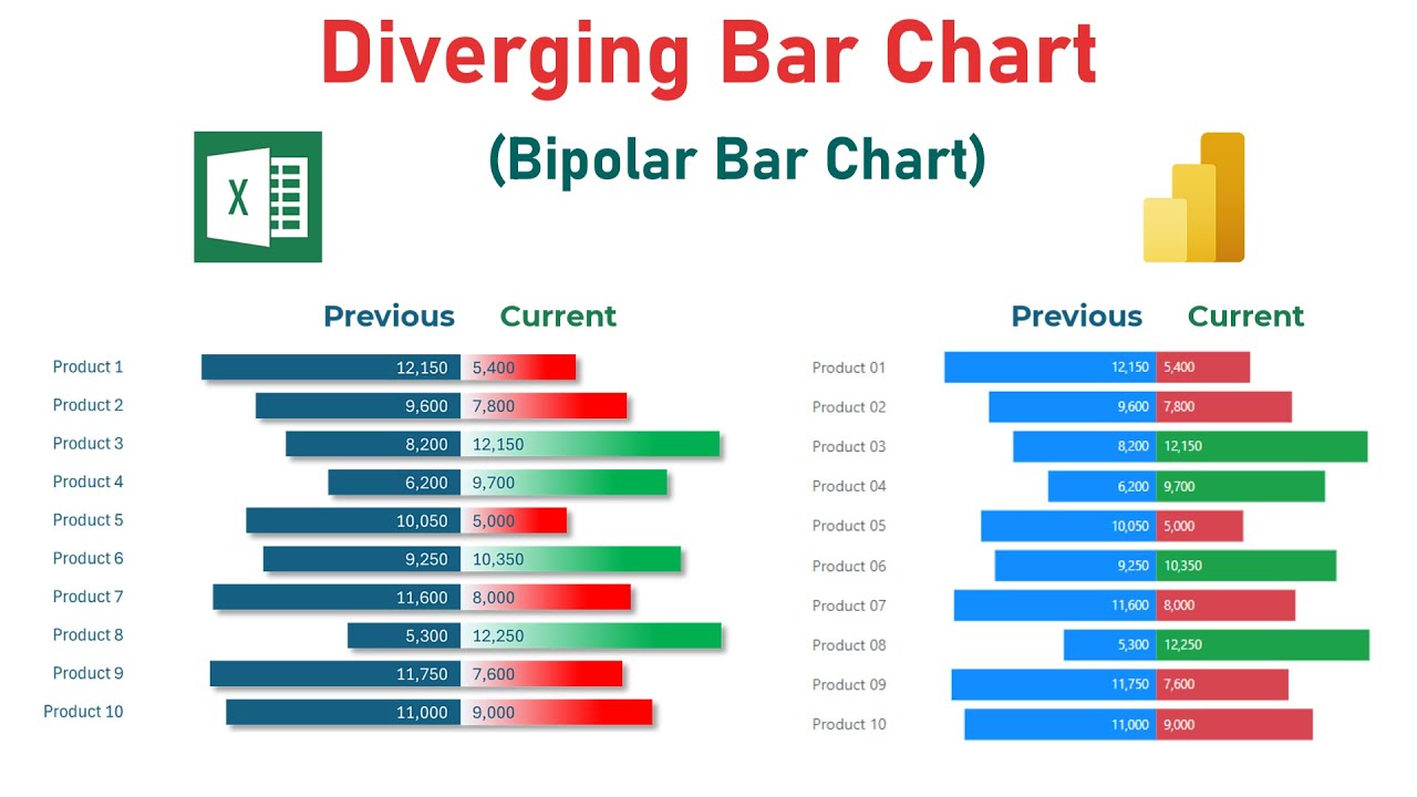
Understanding Diverging Bar Charts:
What is a Diverging Bar Chart?
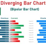
A diverging bar chart splits datasets across a central axis, allowing for a direct and balanced comparison of data points. It’s particularly useful for visualizing data that diverges from a median, such as deviations from an average or differences between two time periods.
Why Use Diverging Bar Charts?
These charts are invaluable for presentations or reports where you need to highlight significant variances within data. They instantly convey which items are performing above or below a certain threshold, making them ideal for quick decision-making.
Differences Between Diverging and Traditional Bar Charts
Unlike traditional bar charts, which typically display bars in a single column or row, diverging bar charts use a central axis as the reference point, emphasizing the direction and magnitude of change.
Dive Deeper with our YouTube Tutorials:
To get a visual and detailed step-by-step guide, be sure to watch our YouTube video tutorial. Throughout the video, it is demonstrated how to create and customize Diverging Bar Charts in Excel and Power BI. From preparing your data to fine-tuning your chart with advanced formatting options, the tutorial covers all you need to know to enhance your data visualization skills.